Home
appsIntroduction
expand_more favoriteFoundations
expand_more paletteDesign
expand_more grid_guidesCase study
download_for_offlineResources
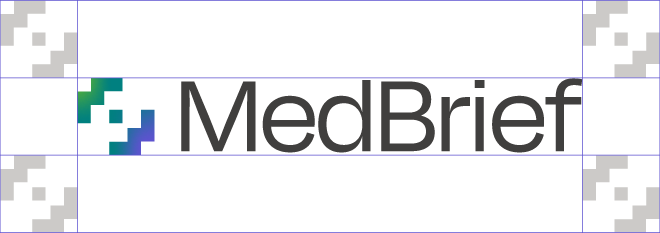
This is our primary logo. Note the horizontal lockup.
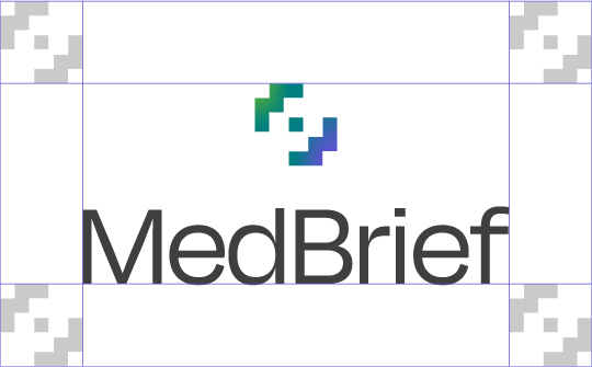
When the primary logo doesn't fit your composition, use the vertical lockup.
Instead of resizing the logo to a tiny illegible size in smaller designs, use the stand-alone icon.
Original icon with gradient fill.
White icon on gradient fill.
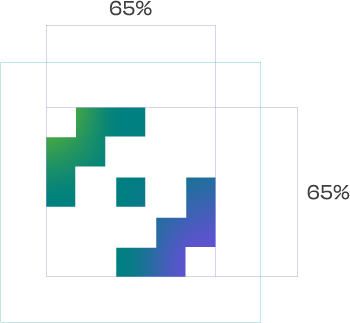
To ensure its integrity and visibility, the logo should be kept clear of competing text, images, and graphics. Always make sure to keep a safe area around it at all sides that is equal to the size of the icon when using the full logo. When using the stand-alone icon, make sure the icon is 65% of the container size.
When placing a logo on a background, aim for ample contrast to ensure readability.
Background colour: Surface
Background colour: Background
Background colour: Surface variant
Light gradient background
Background colour: Dark background
Use as a last option when light or dark backgrounds are not possible.
Background colour: Primary
Background colour: Secondary
Background colour: Tertiary
When using the logo with the gradient icon, make sure to place the icon on a dark part of the gradient.
Use the full white logo on gradients with bright colours.
Always use the original and approved artwork; never alter any aspect of it.
Don't condense or expand
Don't stylize or add effects
Don't warp or tilt
Don't use any other colours or gradients
Don't flip the logo or any element
Don't change the font or font style
Don't change the placement of the icon
Don't change the size of the icon
Don't enlarge small logos which may lead to distortion.
Always make sure there's enough contrast between the logo and the background.
Don't use the gradient icon on our primary, secondary or tertiary backgrounds.
Don't use the gradient icon on top of another bright gradient that blends with the icon.
Don't use the logo on busy backgrounds.